Kakuro is the most recent puzzle to be described by the cliché "the latest craze in Japan is now sweeping the UK." It has similarities with sudoku as far as numbers have to be slotted into rows and columns based on which numbers occupy other squares, but there is one significant difference: kakuro does involve some maths.
Take a look at kakuro.info‘s daily puzzle to see what a whole puzzle looks like.
How it works
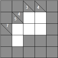
Given a grid, the aim is to ensure that every block adds up to the number at its beginning, using the digits 1-9 a maximum of once each. The numbers in the grid below indicate that the top row must add up to 4, the second row to 7, the first column must add up to 5, the second column to 3 and the third to 4.

The key with kakuro is to know some of the most common patterns of numbers that add up to certain targets. For example, 3, as in the second column of the grid, can only ever be the total of two digits: 1 and 2. Just knowing this tells us that the second column has a 1 and a 2, but we don’t yet know in which order.
more…
From Popbitch:
Tom Chaplin from Keane, on the train going to his parents’ house last weekend, drinking Ribena, doing the Daily Telegraph Book of Sudoku. Rock’n roll.
And where does that elusive 9 go? Somewhere only we knooooow…
| Comments off
Apparently, Alan Rusbridger would like us to “email” theguardian with opinions on its new Berliner format. Get with the programme daddy-o! No-one emails anymore. Don’tcha know it’s the blogs where it’s @ now?
<cough>
All in all, I think the new Guardian is pretty good. Yes, and pretty. (I was a mite touched that Saturday’s paper concluded with “The End”, sensitive soul that I am.) The size is much better and just right for folding on the train without bashing the person next to meyou in the face.
There are, of course, some ways it could be improved, and I sense a blogosphere consensus on some of these. There seems to be little enthusiasm for the new masthead, with its rather passé combined lower case words, and there are concerns about the use of white space and the rather large drop caps.
My wishlist
- Less white space under headlines and in the Comment section
- Footnotes are a good idea, but not when tackily designed to look like hyperlinks
- Restructure the crossword so that it fits in a quarter of the page (so that the paper can be folded comfortably behind it) and move the setter’s pseudonym back above the grid
G2 is a handy size now, and although the terrestrial TV listings have been relegated to the inside, they do now have digital listings located more conveniently alongside. There is also a kakuro puzzle, the rather more mathematical cousin of sudoku.
See also: doctorvee, Chris A, Mike.
The Daily Bile is running a week of particularly challenging sudokus. Yesterday’s involved using the digits 1-9 once only on each diagonal, which was fun, and today’s is an Saturday Independent style super sudoku.
Thanks to a rather too obvious web page naming convention… tomorrow’s is two grids joined together; Thursday’s is overlapping grids; and Friday’s is a very strange mixture of shapes filling a standard 9×9 grid. All will make a change from the usual fare, but do get hold of one of Polly Toynbee’s clothespegs before visiting the website.
| Comments off


Recent comments