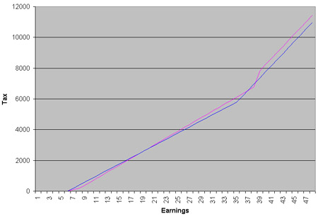
From the budget report, I’ve attempted to knock up a simple tax graph showing you who will be worse off and who better off under Gordon Brown’s new plans. He’s announced a cut of 2p in the basic rate of tax effective next April, but he’s also abolishing the starting 10% rate of tax, with no concomitant increase in personal thresholds announced. Here’s the basic effect – the blue line is the new tax regime as if applied today, the purple line is the current regime:

There are some caveats: Brown is making working tax credits more generous, so they will continue to a higher level, helping people on the lowest incomes (that’s my attempted interpretation anyway); and the top NI threshold will be raised, increasing slightly the NI paid by the richest.
The upshot, though, as far as I can see, is that if you earn in the £7k-£18k band, you’ll pay more tax despite this headline tax cut. The biggest beneficiaries appear, from the graph, to be those earning around £36k a year.
This is all rather back of the envelope so corrections welcome…
Update: Ryan’s worked out that £18,605 is the salary figure when you switch from loss to gain.


Seems a bit unfair. I’ll be a few quid better off but someone earning half my salary will be worse off. I’d happily have it the other way round.
It seems that 12 months down the line, Labour MPs are cottoning on to what you and I realised way back in march 2007.